skip to main |
skip to sidebar
A POTPOURRI OF PICTURES. A GLIMPSE OF LIFE AROUND ME.
A POTPOURRI OF PICTURES. A GLIMPSE OF LIFE AROUND ME.

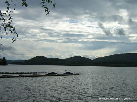
I just wanted to share the original version of the photo"Stillness" that I posted yesterday. This is the unaldurated/untampered :) version of the picture. The only thing I did here was to add the Copyrights text. Which is better?
Posted by Potpourri @ Thursday, June 09, 2005
Labels: Nature
10 comments:
They're both really appealing, but I have to say I'm partial to the black and white version--the lighting just looks so much more dramatic! Still, in this one, I love the tiny hints of blue peeking out from between the clouds...
On the whole I like the B&W. Am biased as far as B&W goes ;) But in this i like the sky the color adds some drama to it.
i agree with Kaleidoscope, in this one the blue sky makes it feel more natural, but still monochrome bias... :)
Mmm mixed opinions :) Thanks guys.. I like this one more because of the blue black skies..
i like this one better .. especially the sky - the varying shades of blue and grey. b/w has a different feel .. its amazing how much u can get out of just these two colors!
Liked this better... Somehow felt this shows life in a brighter way...
This is also very pretty.
I guess i like the other one better, its more dramatic in b&w.
Thanks Ian. I guess you are right, one cannot satisfy everyone at the sametime..
Ksms and Art you are with me :)
Thanks Art for visiting my blog and taking time to comment. Keep visiting.
Thanks Tequila.
Like both of them!
:) Thanks Suyog.
Post a Comment